The rule is that you have to do your logo in black and white first then in color.
|
a. A combination logo is logo that has the name of it and the logo
b. I learned that your logo should be able to be black and white, and in color 1.The first step that I did in the design cycle was investigation. I had to investigate what time period i wanted to do and I had to investigate ten facts on my time period. Next I had to plan on what my character is going to look like, and what my story was going to be like. Next i had to create my character. I ran into a few problems but it turned out pretty good. The last thing that I had to do was evaluating. I had to evaluate my project at the end.
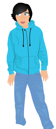
2. I think my character turned out better than I thought. At first I didn't think it would turn out as good as it did. 3.I could have worked on my finger nails more by making them look more real. I also could have worked on my back ground more but I ran out of time. 4.My character is in a different time period than what he is from 5.I added shadows and highlights on my sweatshirt, my pants, my neck, and on my face from my hat 6.If I could do two things differently next time I would probably come in more if I had a chance and I would have made a back ground  Today I want to finish my shading on my pants and finish one of my accessories.
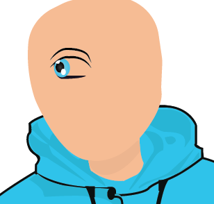
 Two of my goals for today is to get both eyes done and start the hair
 My first goal for today is to get my head shape. Then my second goal for today is to at least get my mouth or eyes on my head.
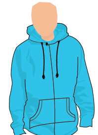
 One goal for me today is to finish my shading on my sweatshirt. My second goal for today is to get started on my head/neck .
 It is a gradual radial gradient because it changes from one color to another going to the center of the shape
|
WillI am a student at ROMS Archives
January 2016
Categories |
 RSS Feed
